Colors to improve healthcare spaces
In buildings where the focus is on health and wellbeing, people need soothing, restorative spaces that can help them recuperate. Discover how subtle and consoling Studio colors can bring softness and comfort to every part of a healthcare space.

First impressions count and, in a healthcare space, you want to create a calm feel to help patients and visitors feel relaxed. Here subtle Studio colors have been combined to create a visually interesting interior that feels restful and easy on the eye.

Warm and inspiring, complementary Studio colors can soften the feel of an exterior and make it more appealing. Here, subtle blues and pinks balance out the hard lines of a glass façade to create a welcoming impression.

Restorative Studio colors can add warmth and softness to a clinical healthcare environment and help patients, visitors and staff switch off and de-stress. Here, soft blue, pink and lilac are set against richer colors to bring personality to a communal cafeteria area.

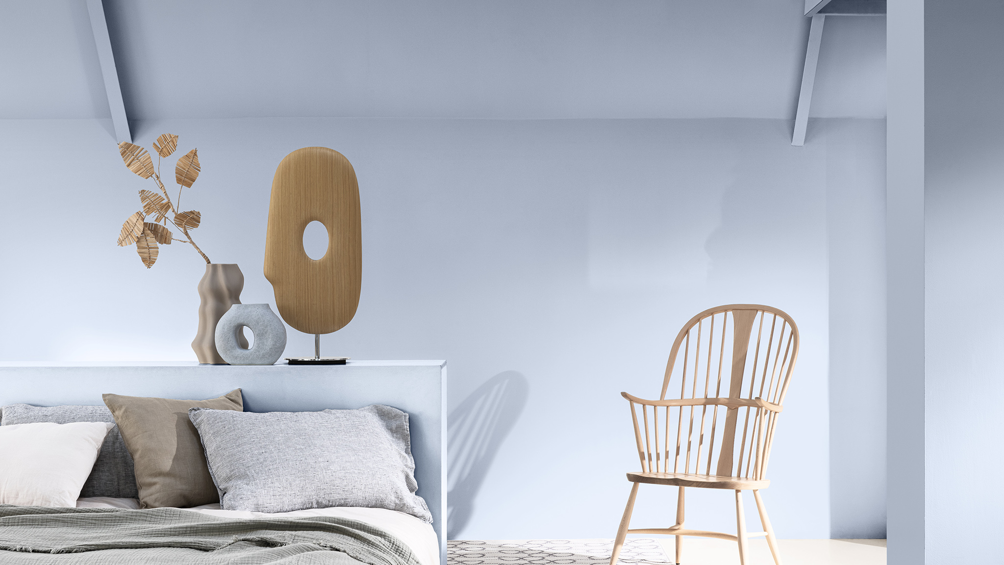
Visitors to healthcare spaces spend much of their time in communal areas, such as waiting rooms, so it’s important to make these feel comfortable and welcoming. Here a combination of soft Studio colors creates a relaxed feel in a visitors’ room.
Subtle and consoling Studio colors, used with Bright SkiesTM, can bring softness and balance to a space, helping people recuperate. Here, the combination of colors adds warmth to a patient room that might otherwise feel cold and clinical.