Colors to boost hospitality spaces
Whether hotel, restaurant or library – hospitality settings offer people the chance to recharge and look at things from a fresh perspective. Discover how CF22 colors can help to create soothing, inspiring spaces that feel welcoming and inclusive.

Used on a ceiling, [Brand] Colour of the Year 2022, Bright SkiesTM can make a space feel airy and open. Here, it’s combined with the pale but warm neutrals of the Salon palette to create a light and inviting pool area.

A restaurant or hotel foyer needs to be an inclusive and inviting space. The Salon palette, with its range of warm neutrals – from deep browns to airy whites, is ideal for creating a welcoming atmosphere. Here, earthy tones are balanced with the fresh feel of Bright SkiesTM for a smart, comfortable interior.

Salon colors are perfect for bringing freshness and unity to a large, open-plan space. Here, a combination of Bright SkiesTM and airy whites gives a light, open and inclusive feel to a public library and provides an effective color counterbalance to the shelves of books. Used from the top to the bottom of the atrium, this color scheme also cleverly connects the separate floors.

Warm and inspiring, the complementary colors of the Studio palette can soften the feel of an exterior and add visual interest. Here – balanced against the fresh blue of Bright SkiesTM, they bring a pop of color and personality to a series of balconies.

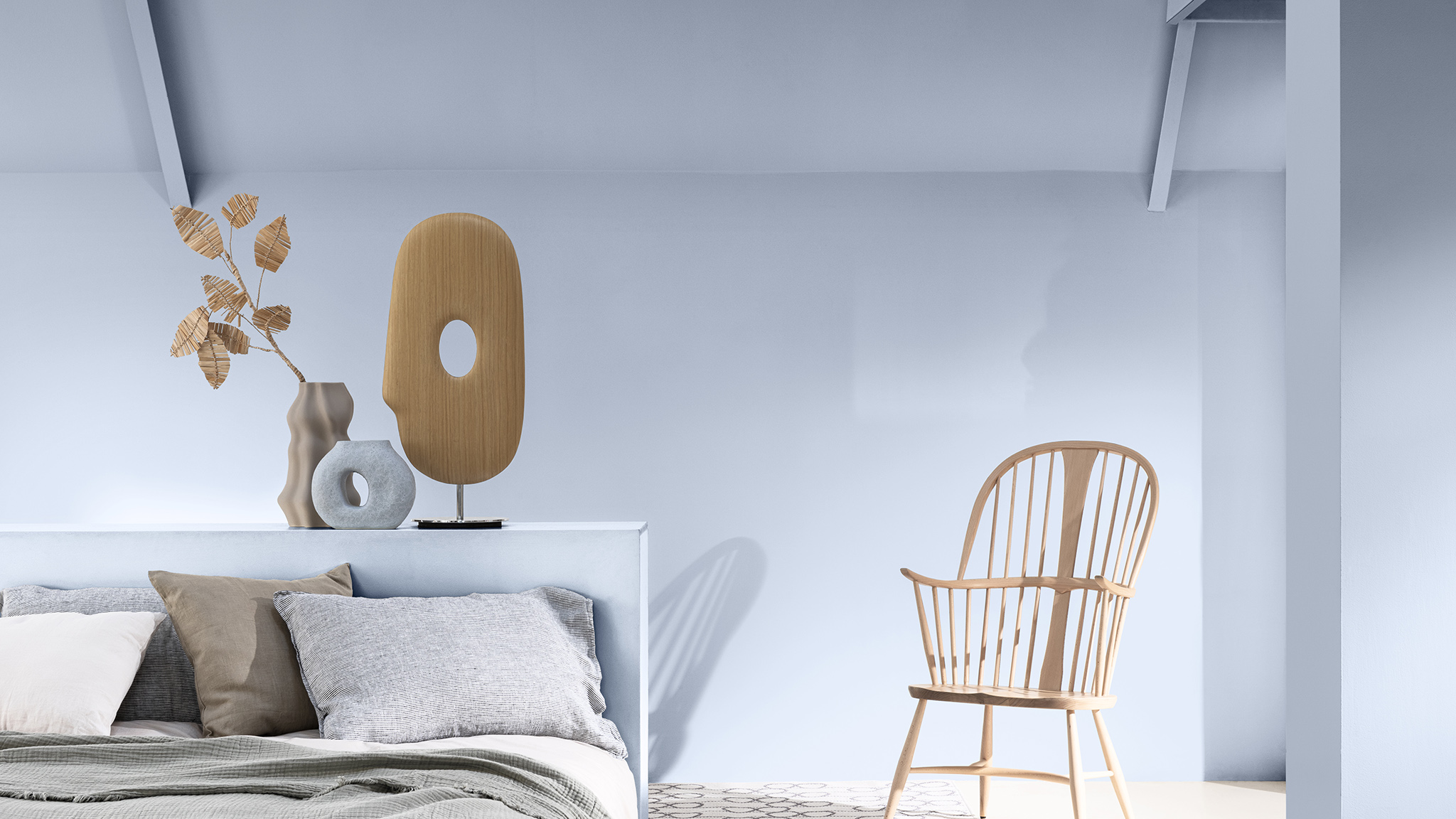
Subtle and sophisticated, Studio colors can bring a quietly glamorous feel to a hotel bedroom – particularly if the colors are carried through into the furnishings. Here a combination of pale grey and soft pastels creates a calm, relaxing atmosphere – perfect for a luxury retreat.